
Simple, sleek, good contrast of colors, CTA and service times up front
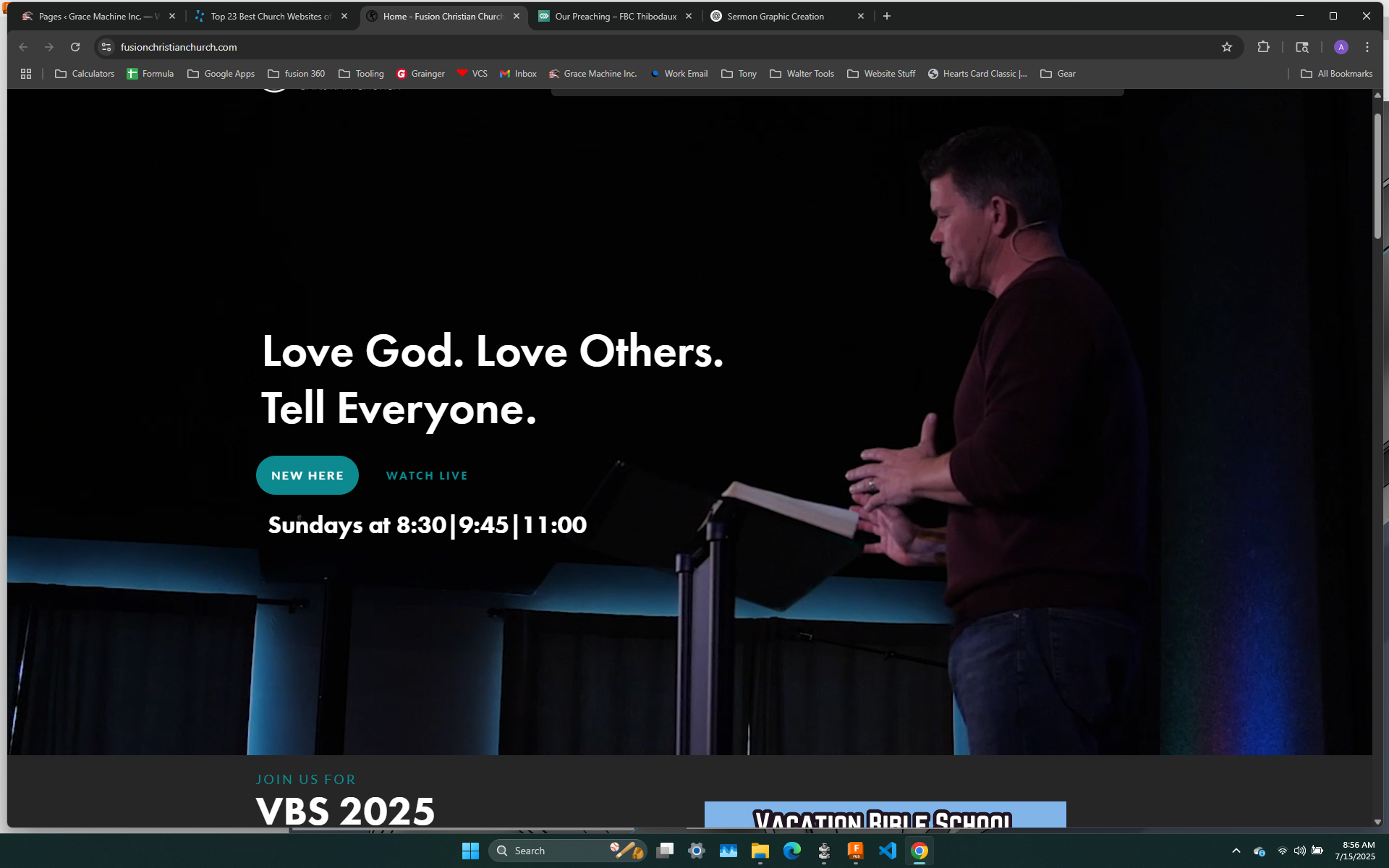
Service times at the top; mission statement at the very first view
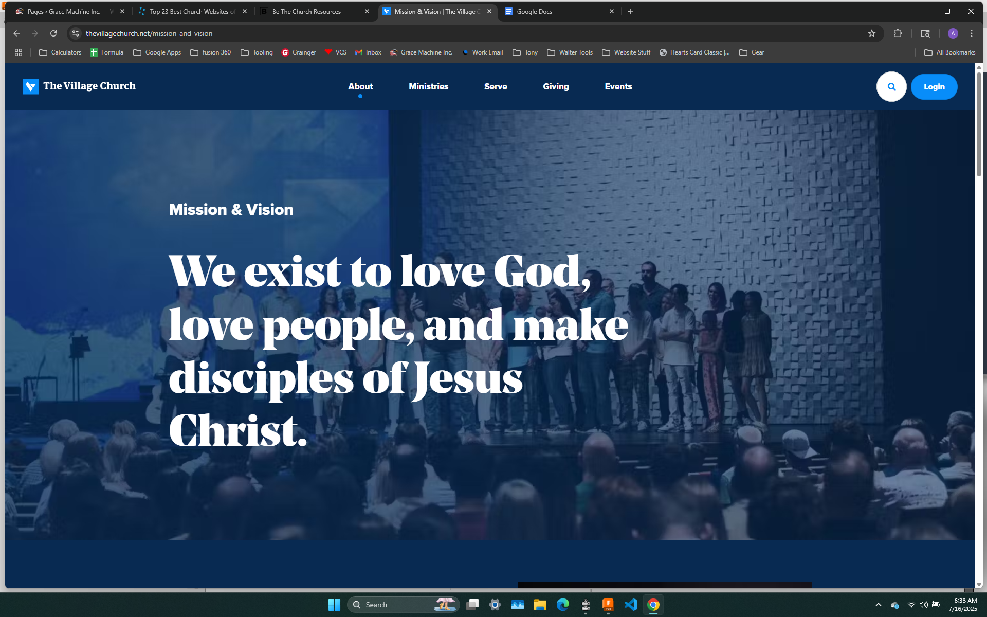
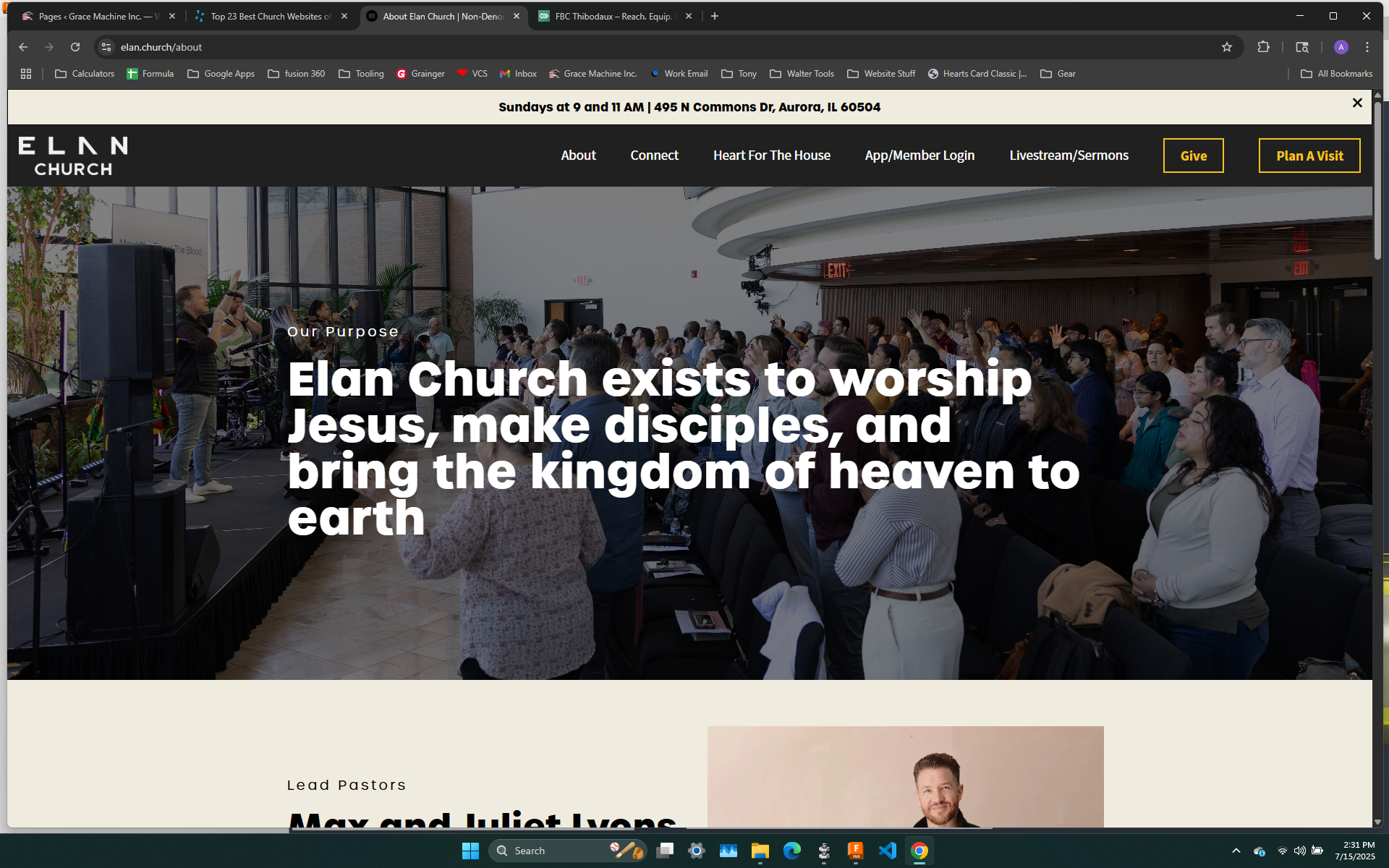
Another mission statement front and center

the background image of a worship service with all of the pertinent info in one place; drop-down menus

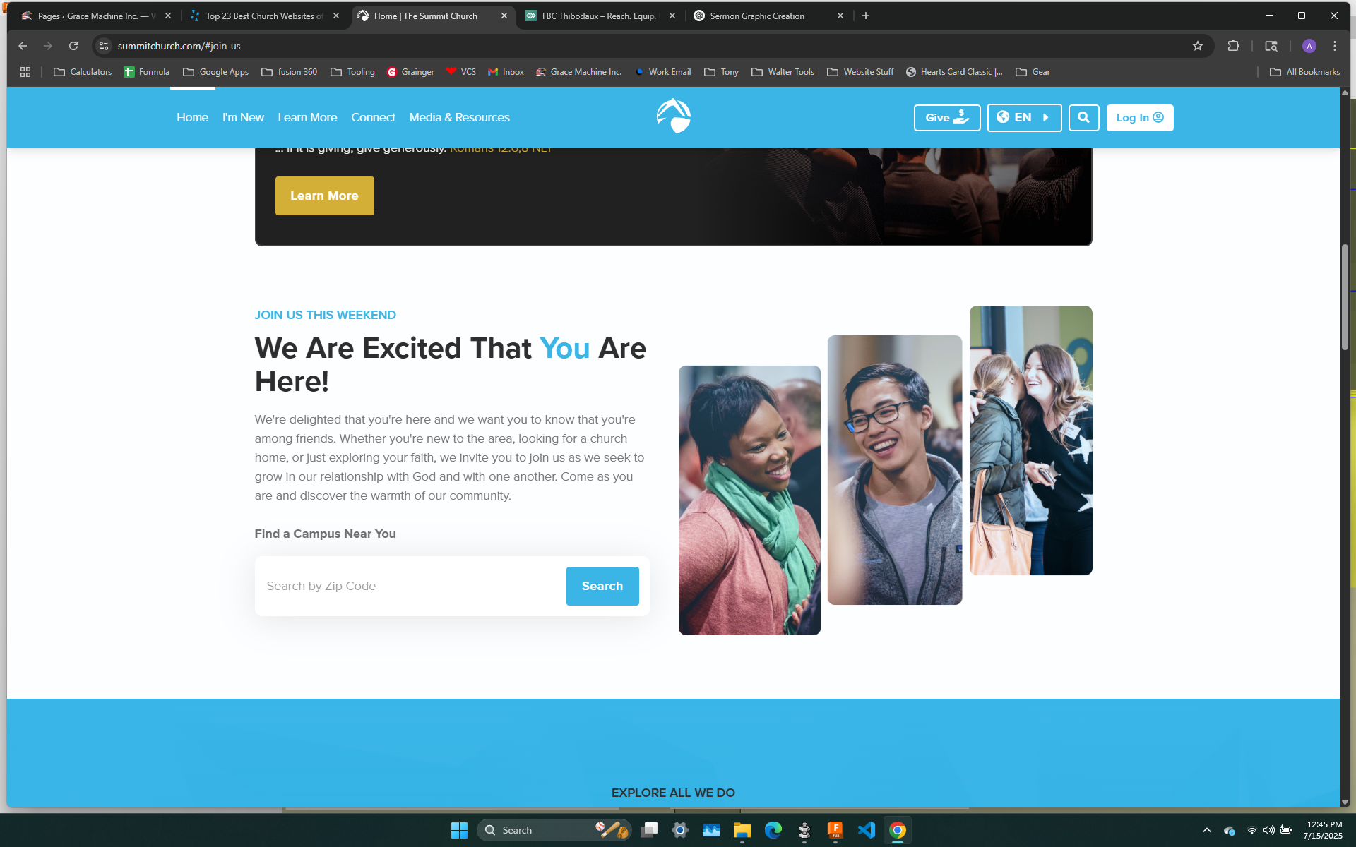
Just another good example of info displayed in one area vs multiple pages
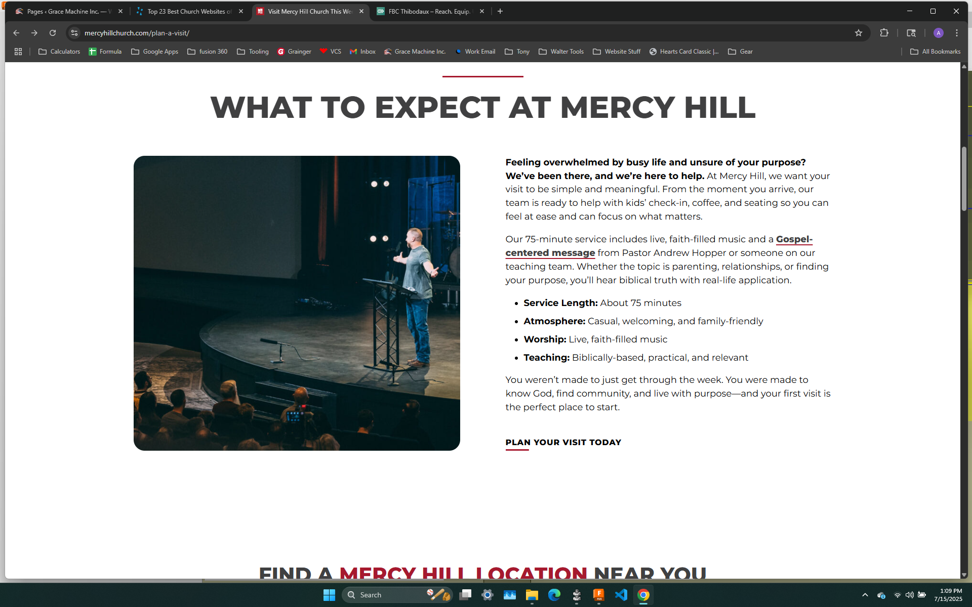
Simple, straight to the point, but done well
Another way to present the pertinent info instead of drop-downs

Simple, transparent site color helps to make it pop
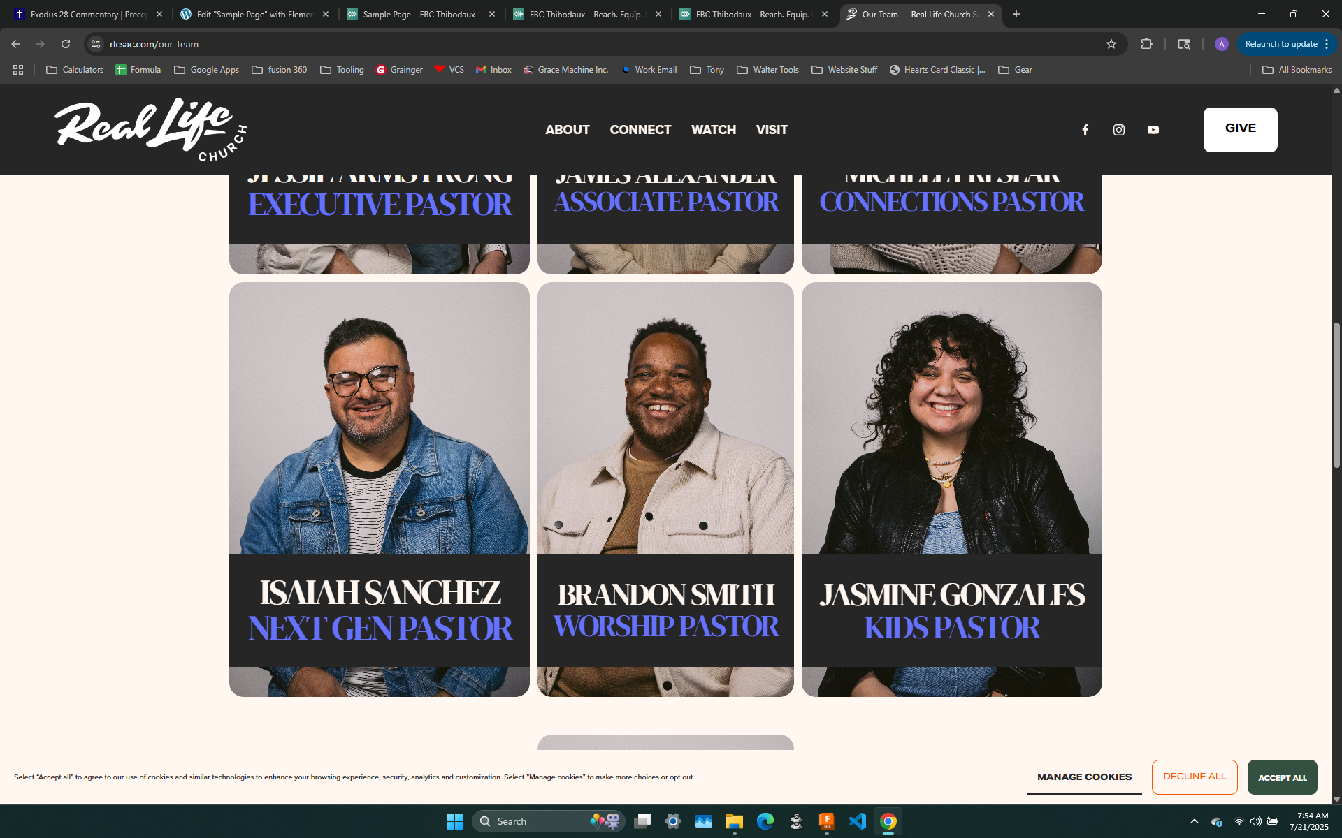
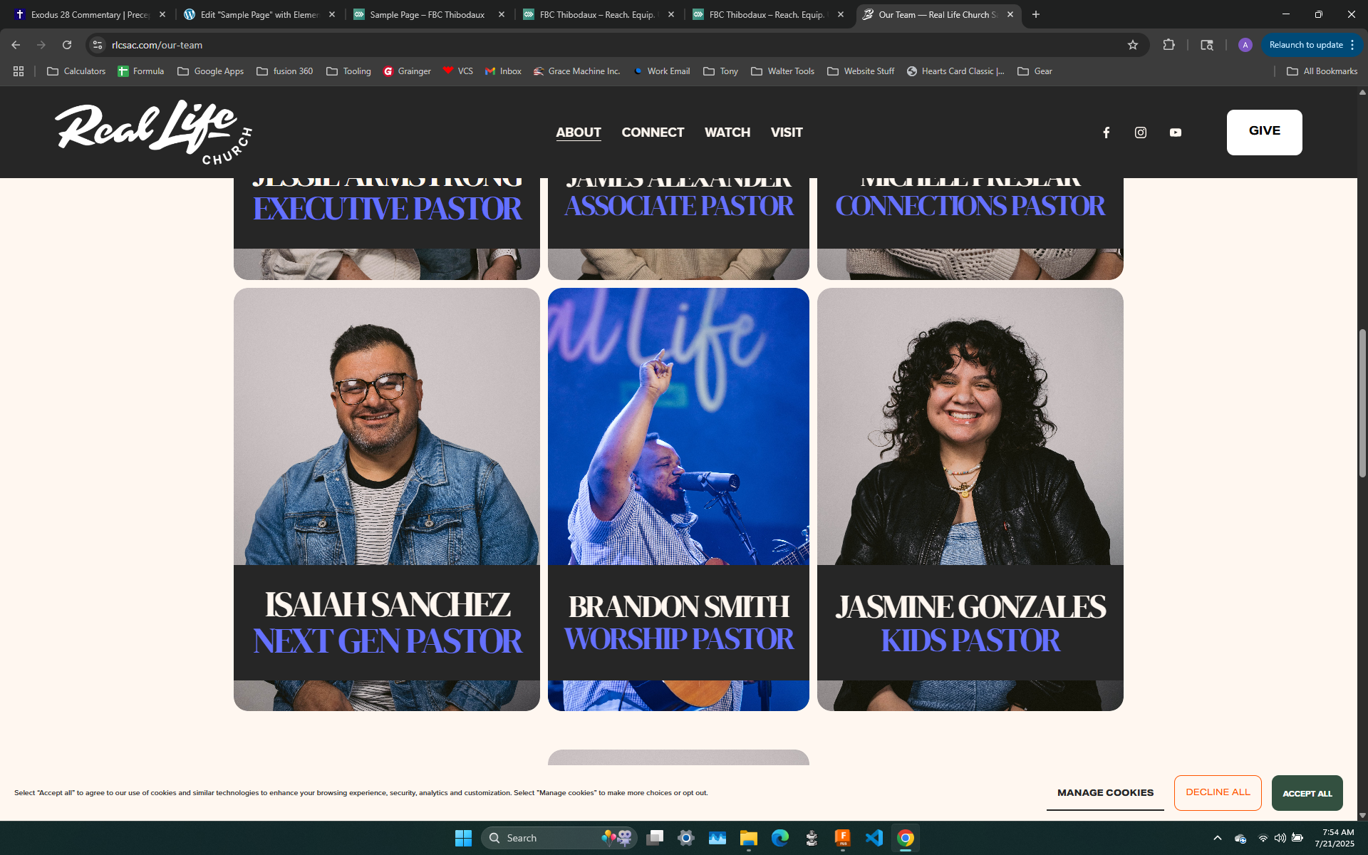
By far, one of the coolest pages I found. Hovering over person reveals another photo of them serving in that position
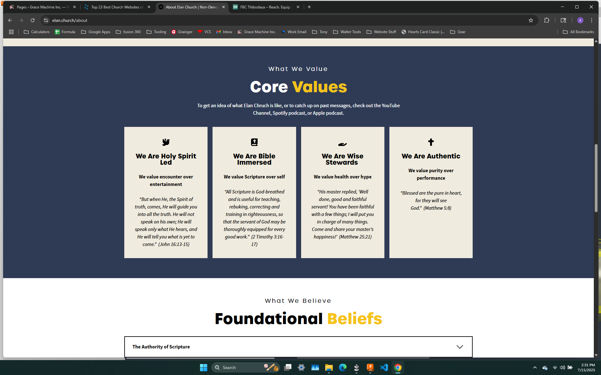
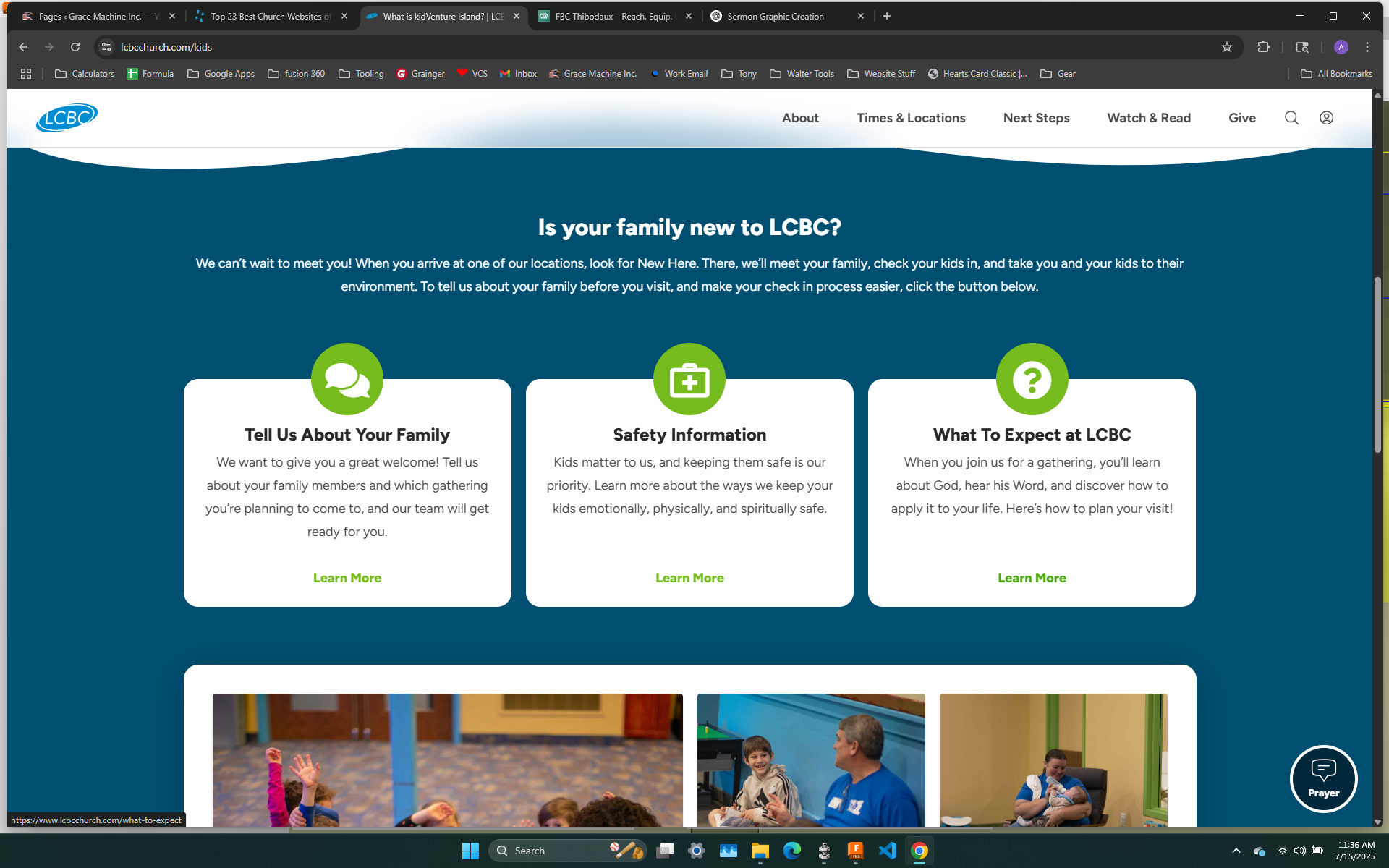
Slightly blah looking but having each core value in a separate box has a nice, clean feel to it

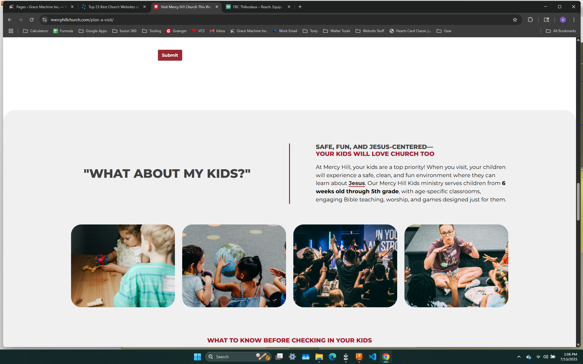
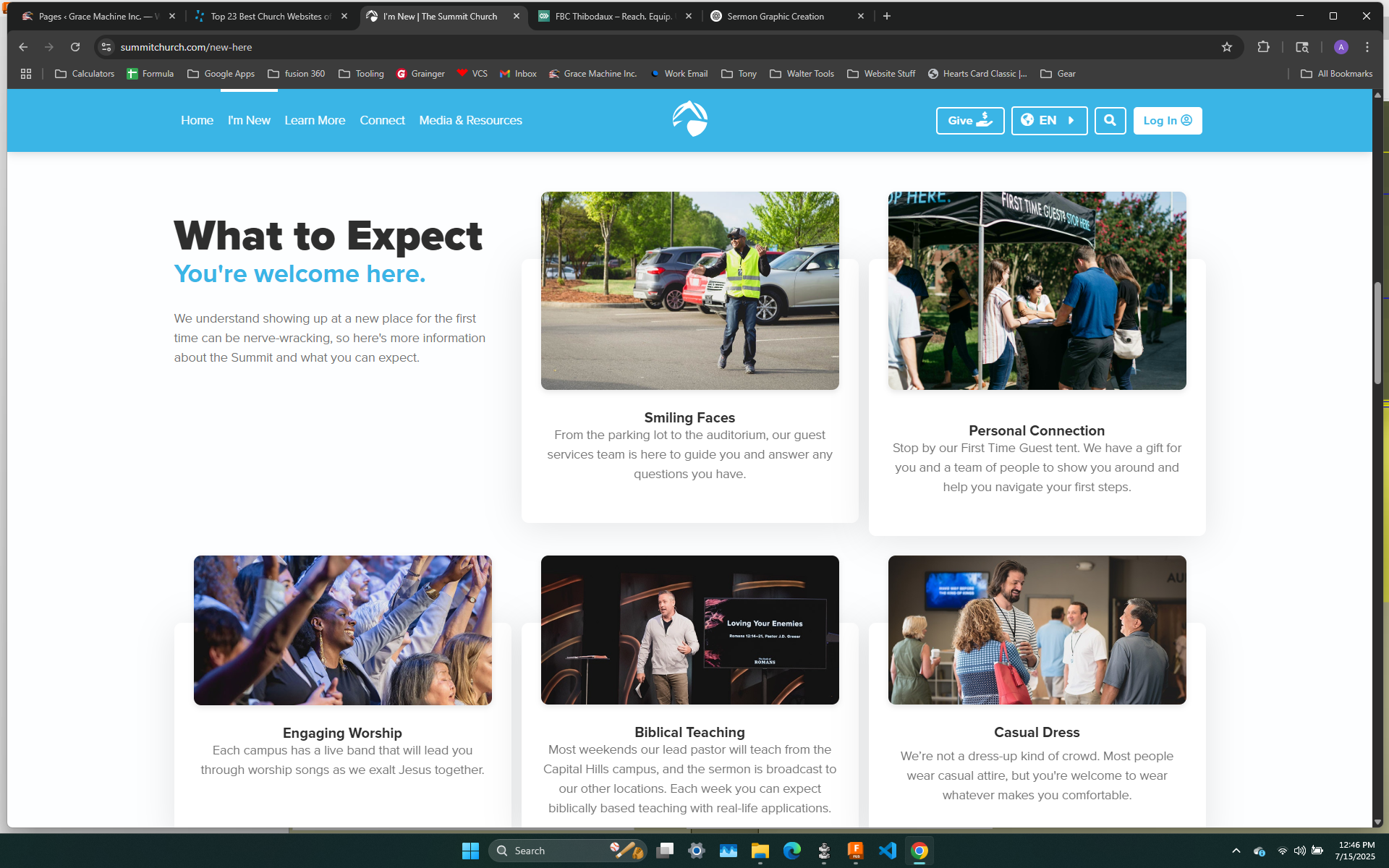
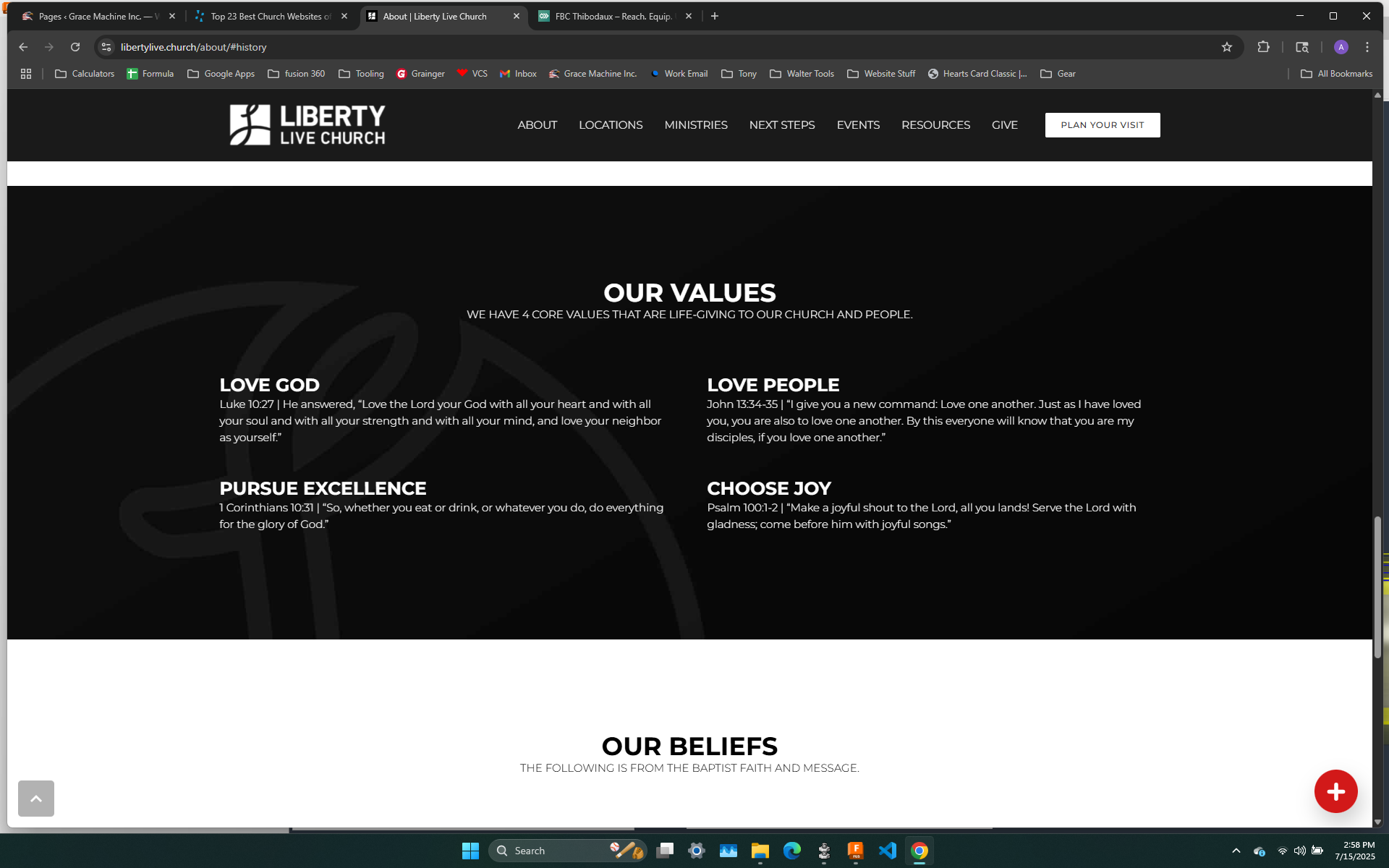
Much better down with having each in its own space with a pic of representing each

Perhaps partnered with previous idea of real life pic of each belief and letting the text be visible when hovered over; or even in a transparent overlay like that one staff pic
Simple, clean, easy to read
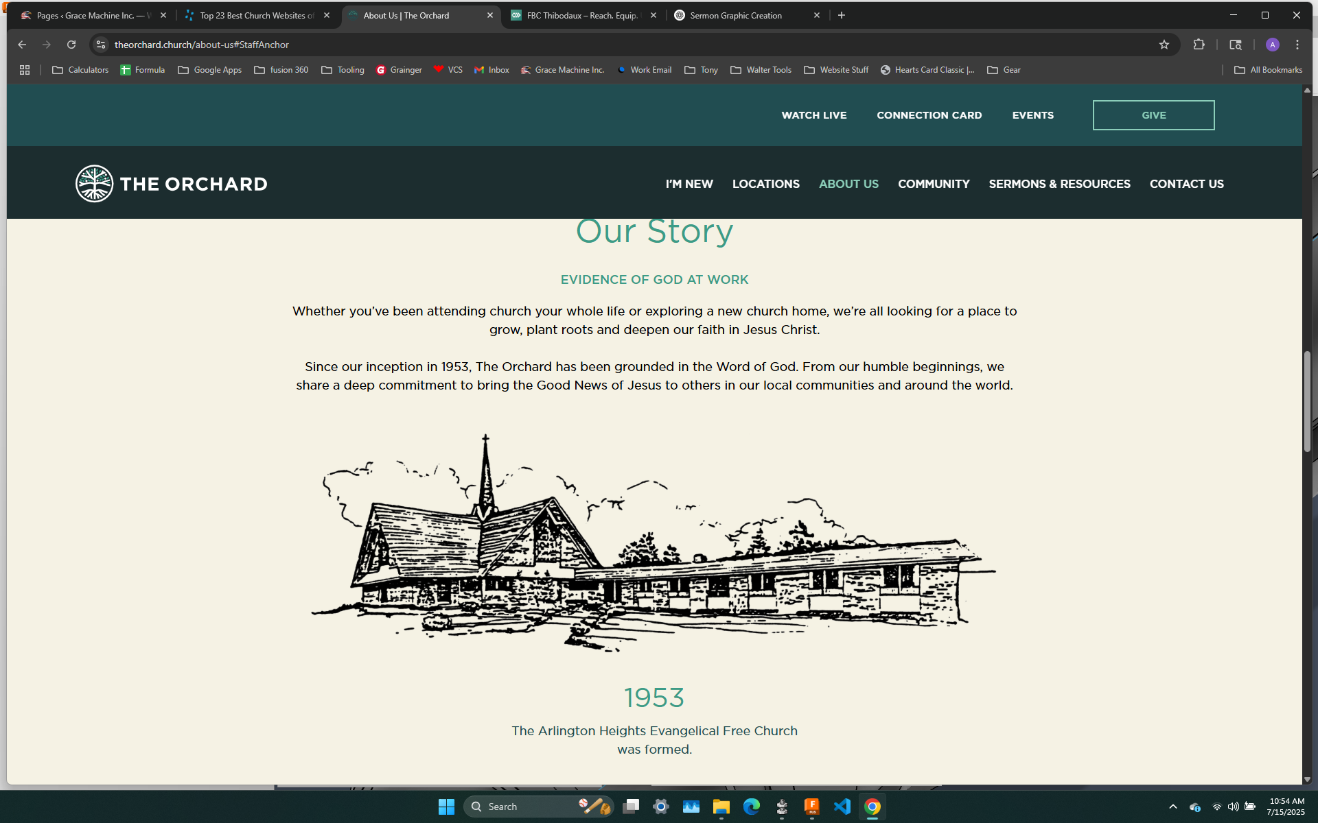
cool "sketch" of church; perhaps a short summary of our history?
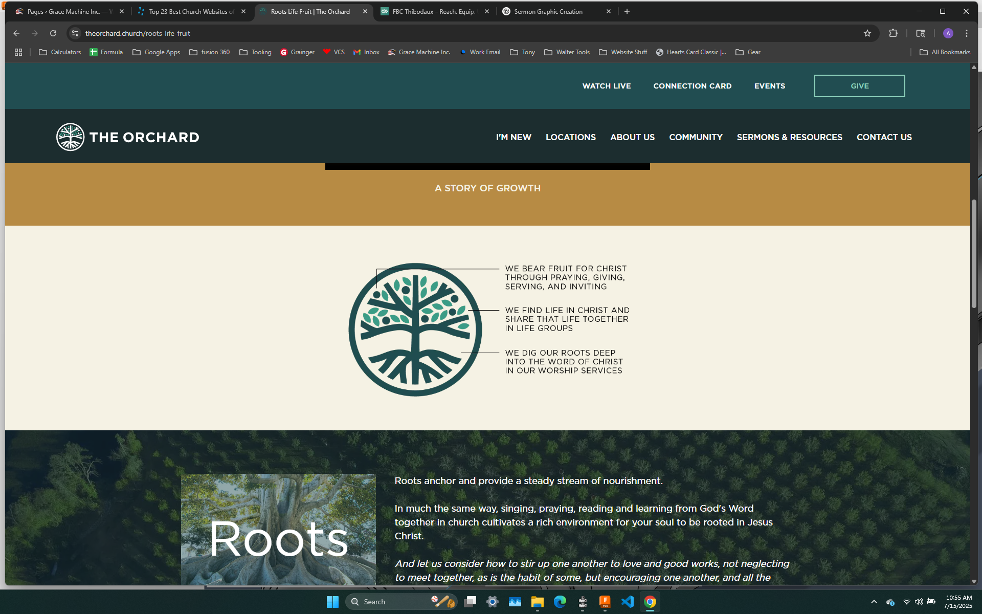
Smaller scale way to explain the logo instead of separate images; perhaps finding a way to have each part explained when that part of the logo is hovered over instead
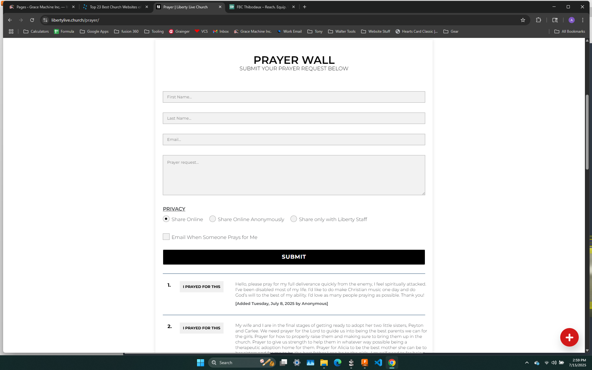
I like that people can pray for a request, click the button, and it shows that X amount of people prayed for this; perhaps keeps the current concept of our prayer form with the added idea of what Kevin Smith was wanting to do with a prayer request update
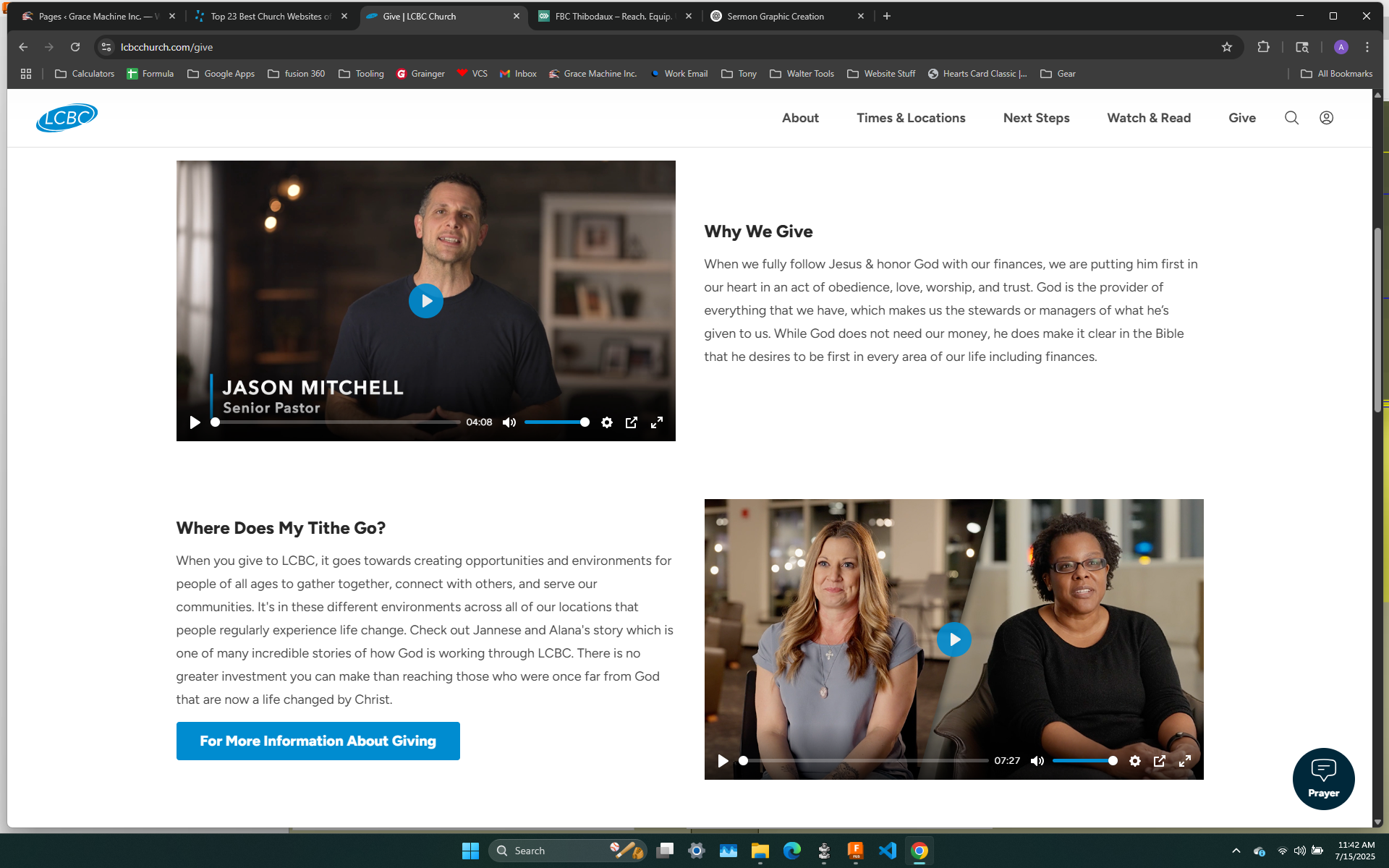
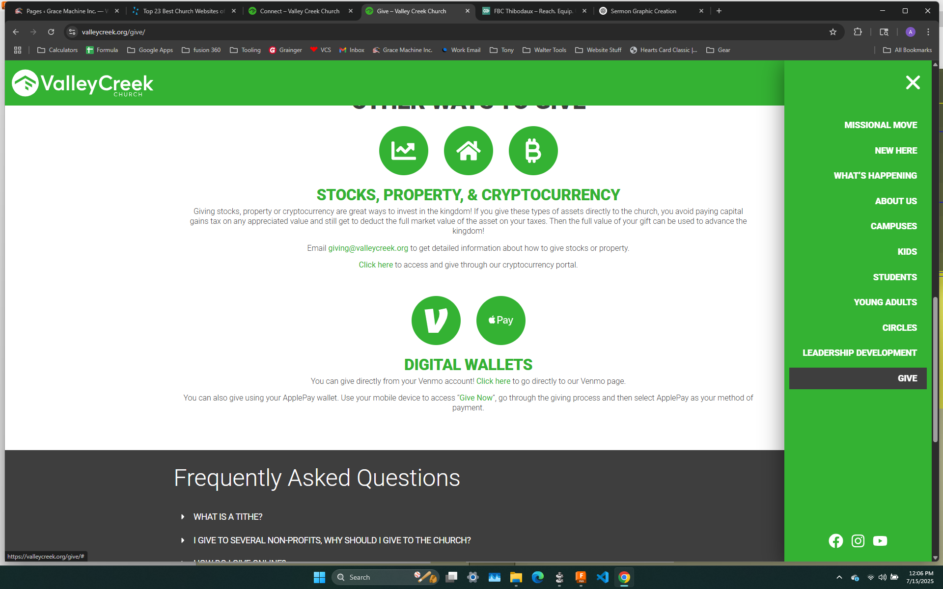
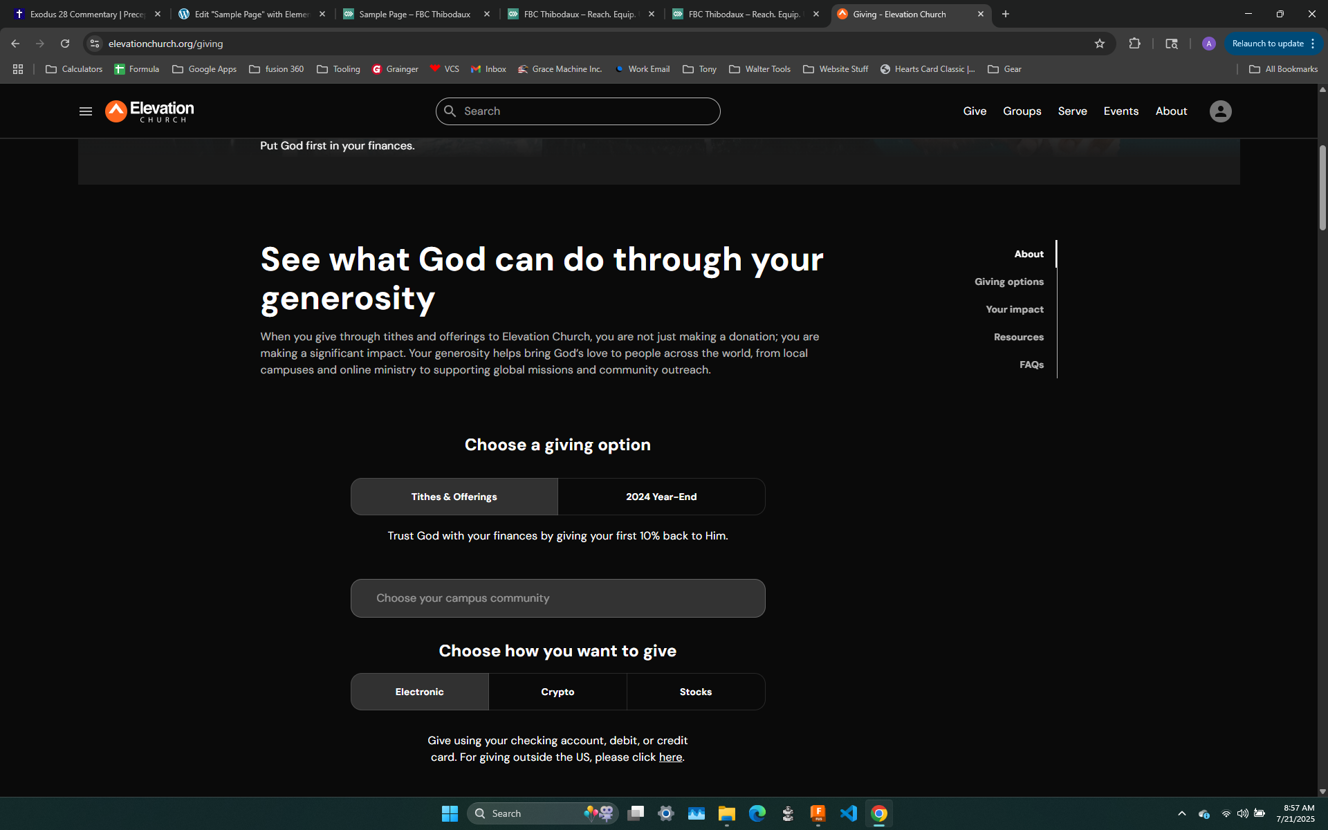
Perhaps links to sermons on the importance of giving
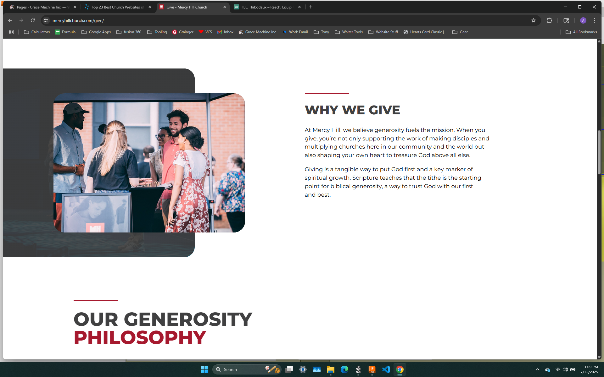
Or a blurb; simple, clean
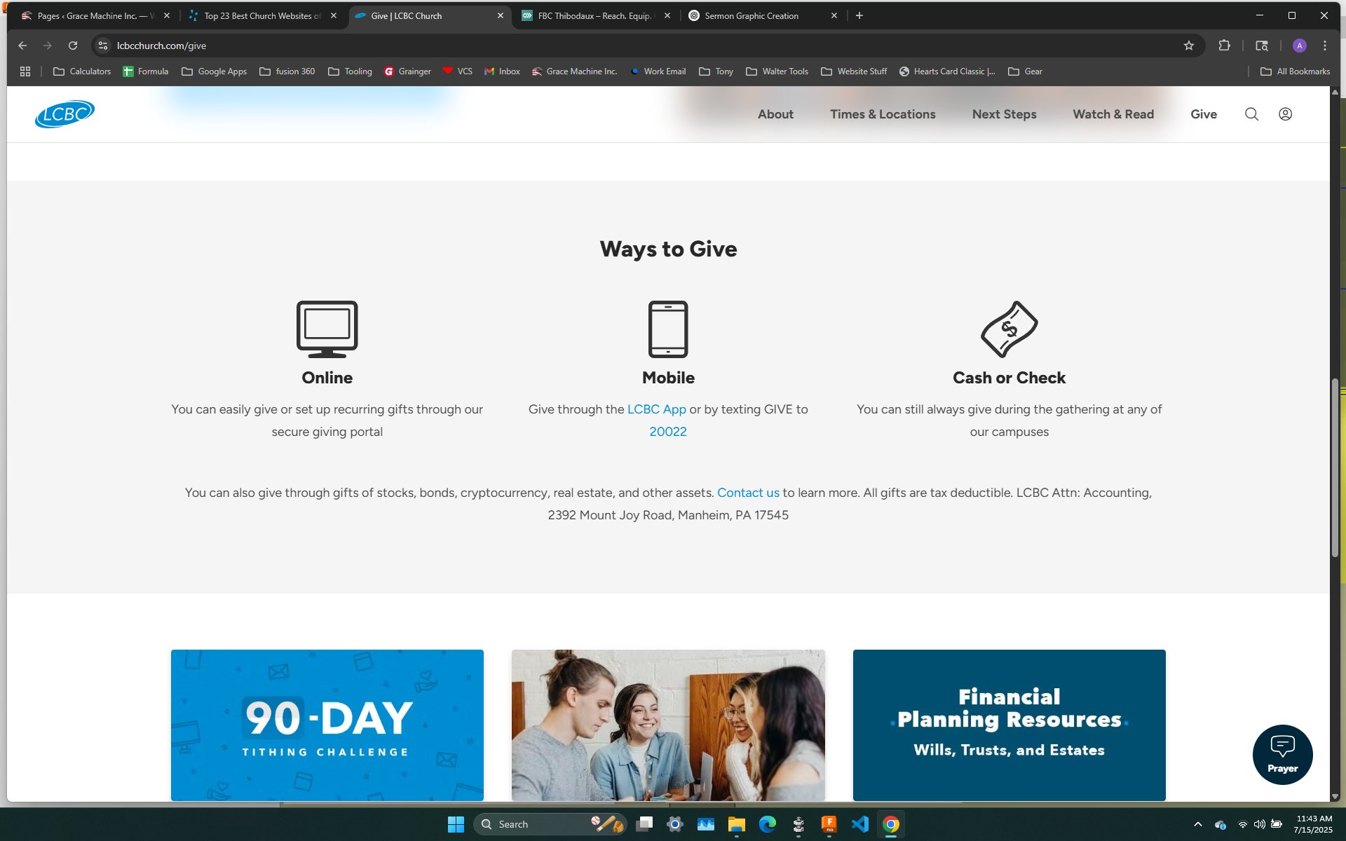
simple, clean look with the icons
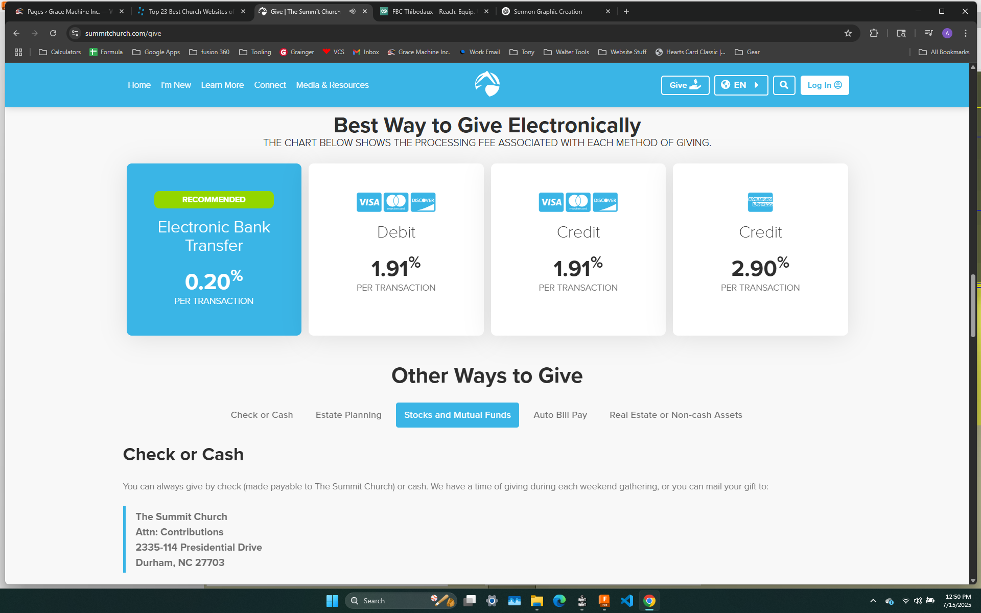
These boxes showing what the fees associated with each transaction is nice
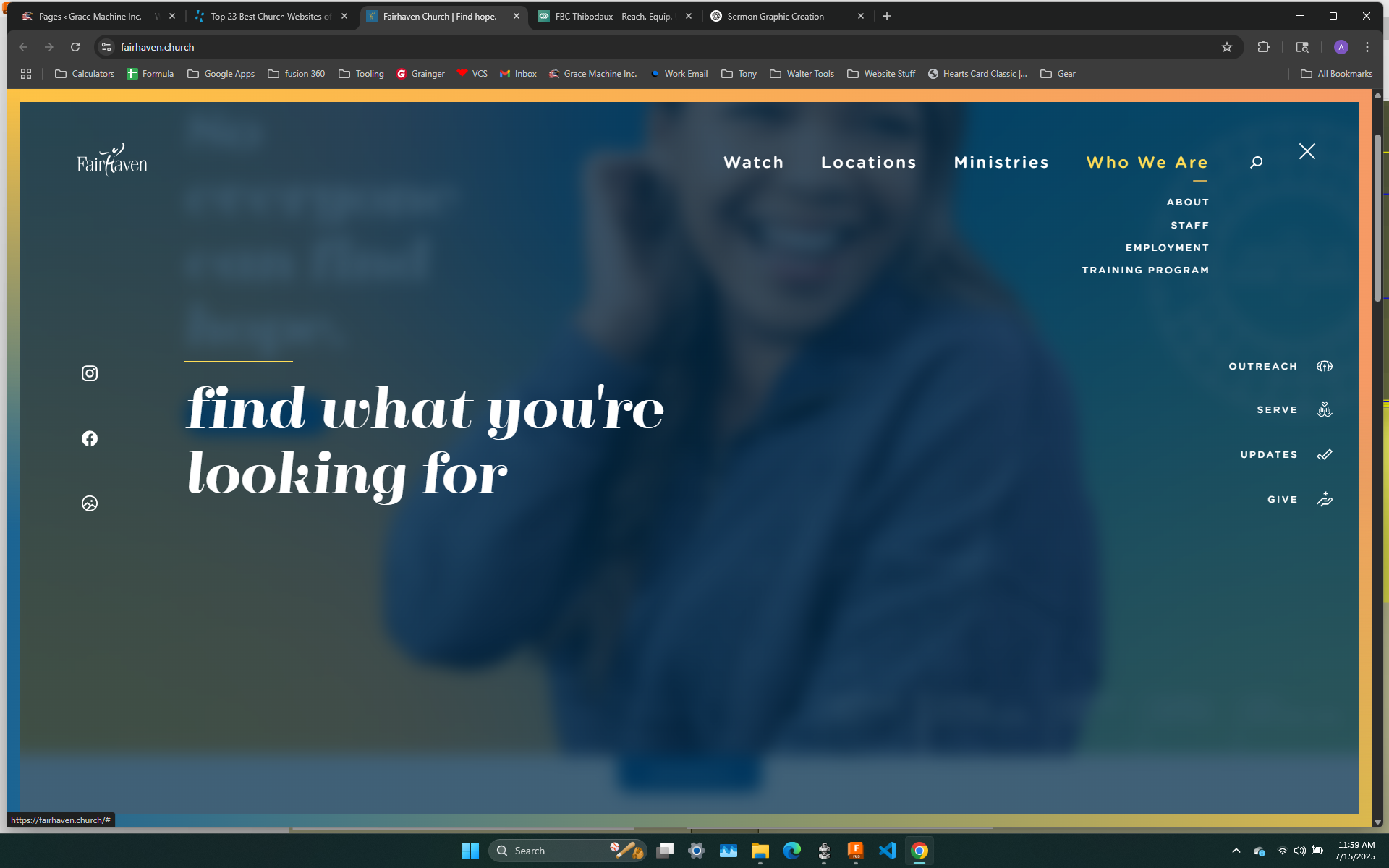
This menu expands over the whole page and the large text on the left changes as you click on the different tabs; but everything is all in one place--simple menu to most popular things on right, social media icons on the left, and full menu at the top

The double menu is neat
Full menu drop down on right side that also has social media icons
Neat looking menu; love the bold headers and the sub menu options in regular font
Same as before but maybe better looking?
social media icons in menu on right
Love the idea of a second, independent menu for longer pages that display only what's on that page

I like how the highlight follows what page you are on; as well as the simple bottom area with the logo and social media icons
Like the logo on the left, social media on the right, and various menus that don't seem confusing; clean

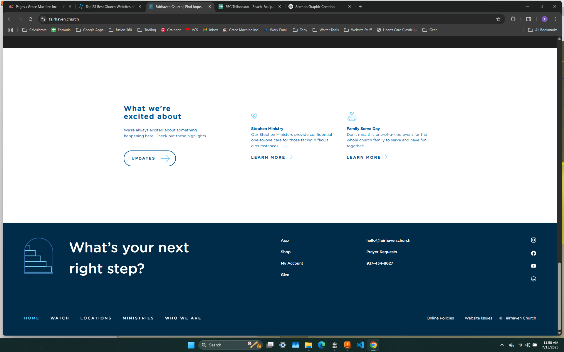
Nice, clean footer--contains mission statement, quick links, social media, etc
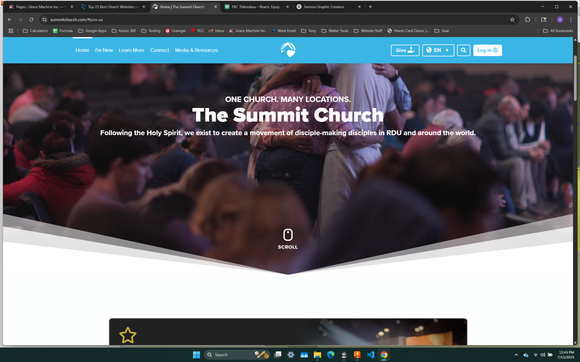
I just like the bottom of the hero slide/video not being square; just creates a "haven't seen it done this way look"

Gives the same vibe that the rows are just rectangles; perhaps something for the ministries page
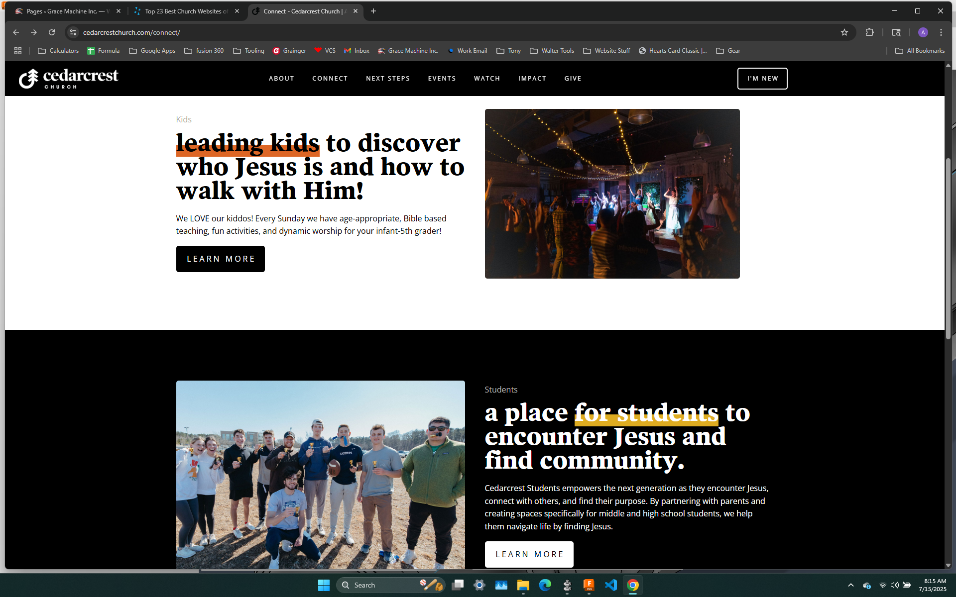
Another clean division for a ministries page type setup
I like the pics each being stepped up; gives another "this is not the traditional template setup" lol
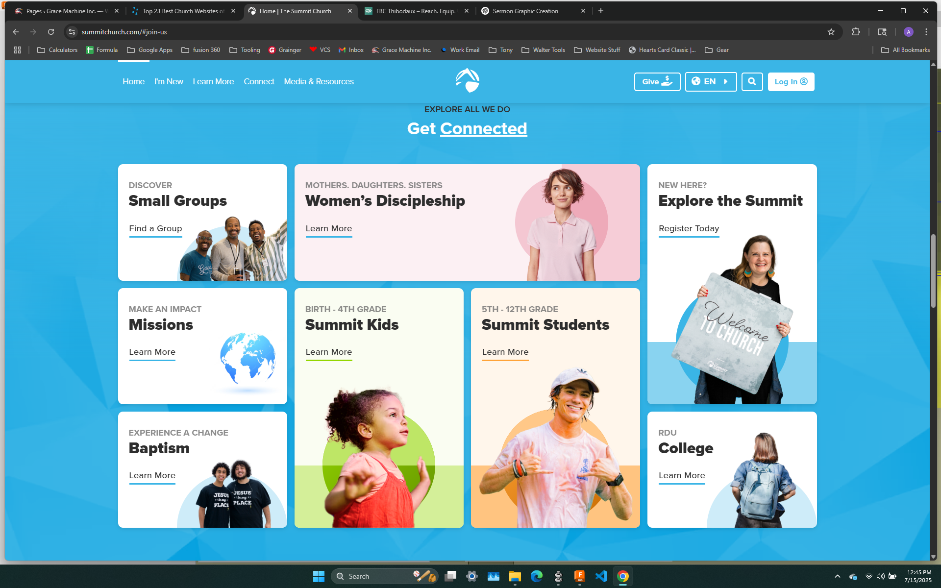
nice, clean setup; perhaps a new way to setup a page like our ministries page

Just a clean before the footer social media icons
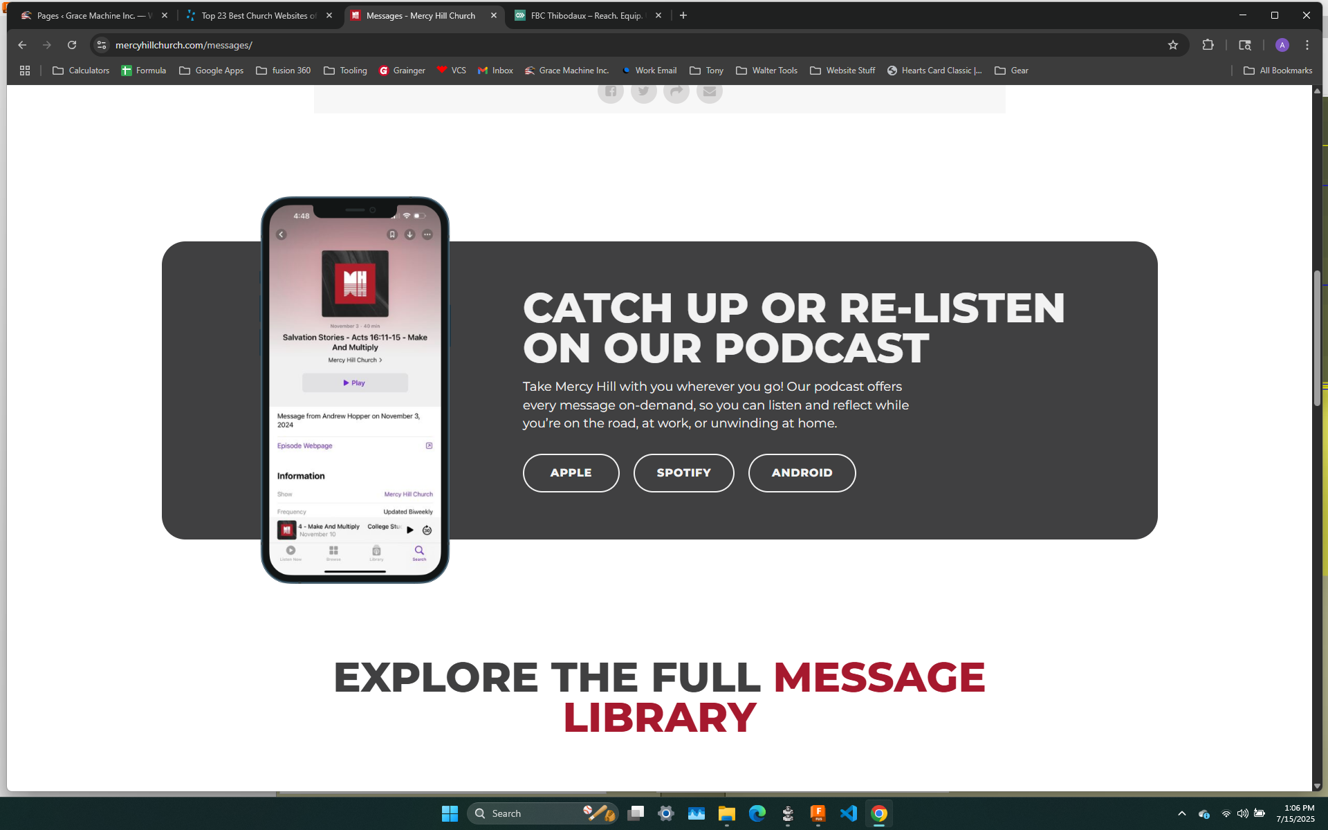
Nice clean look the phone popping out of the rectangle; could be a nice design somewhere
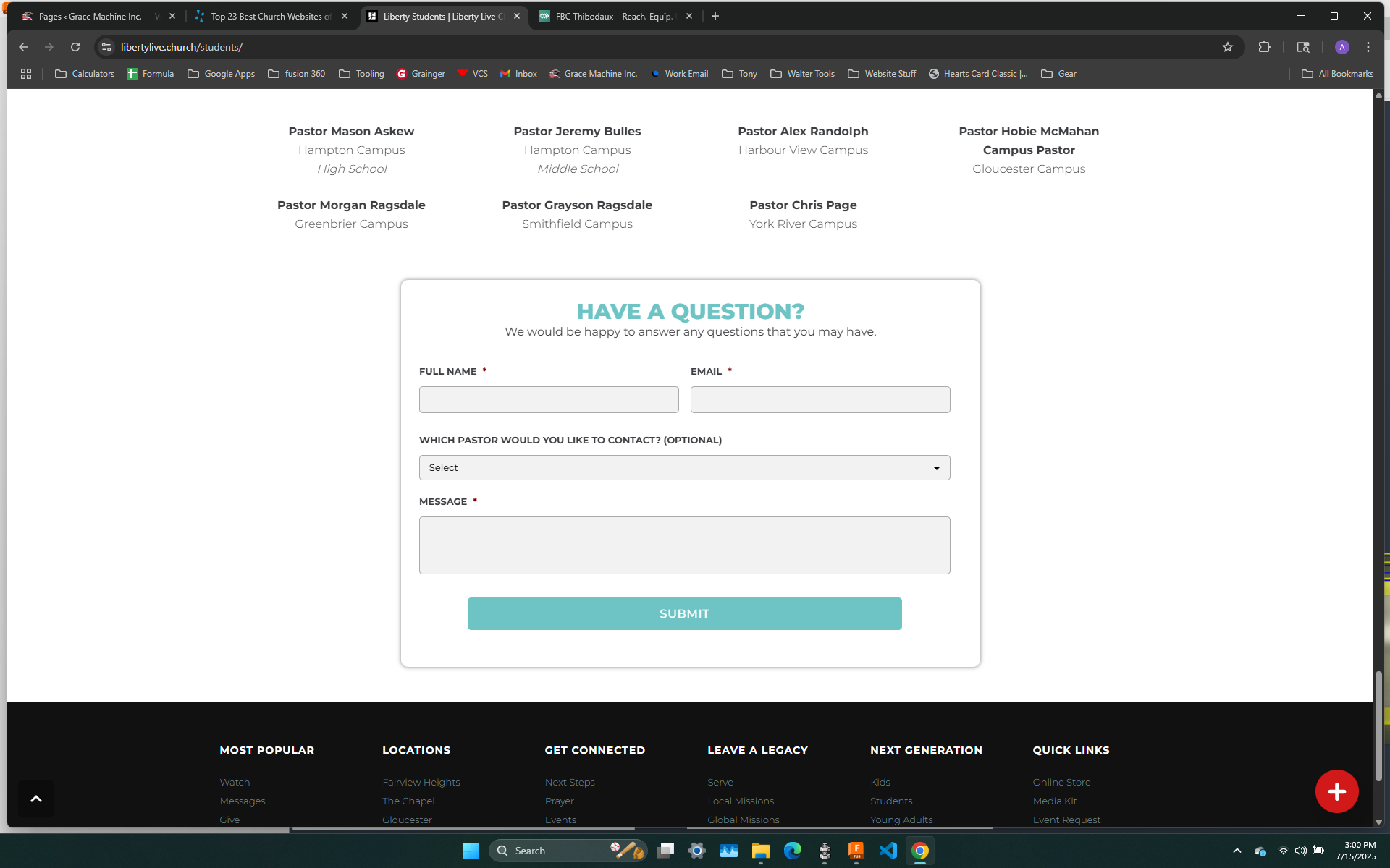
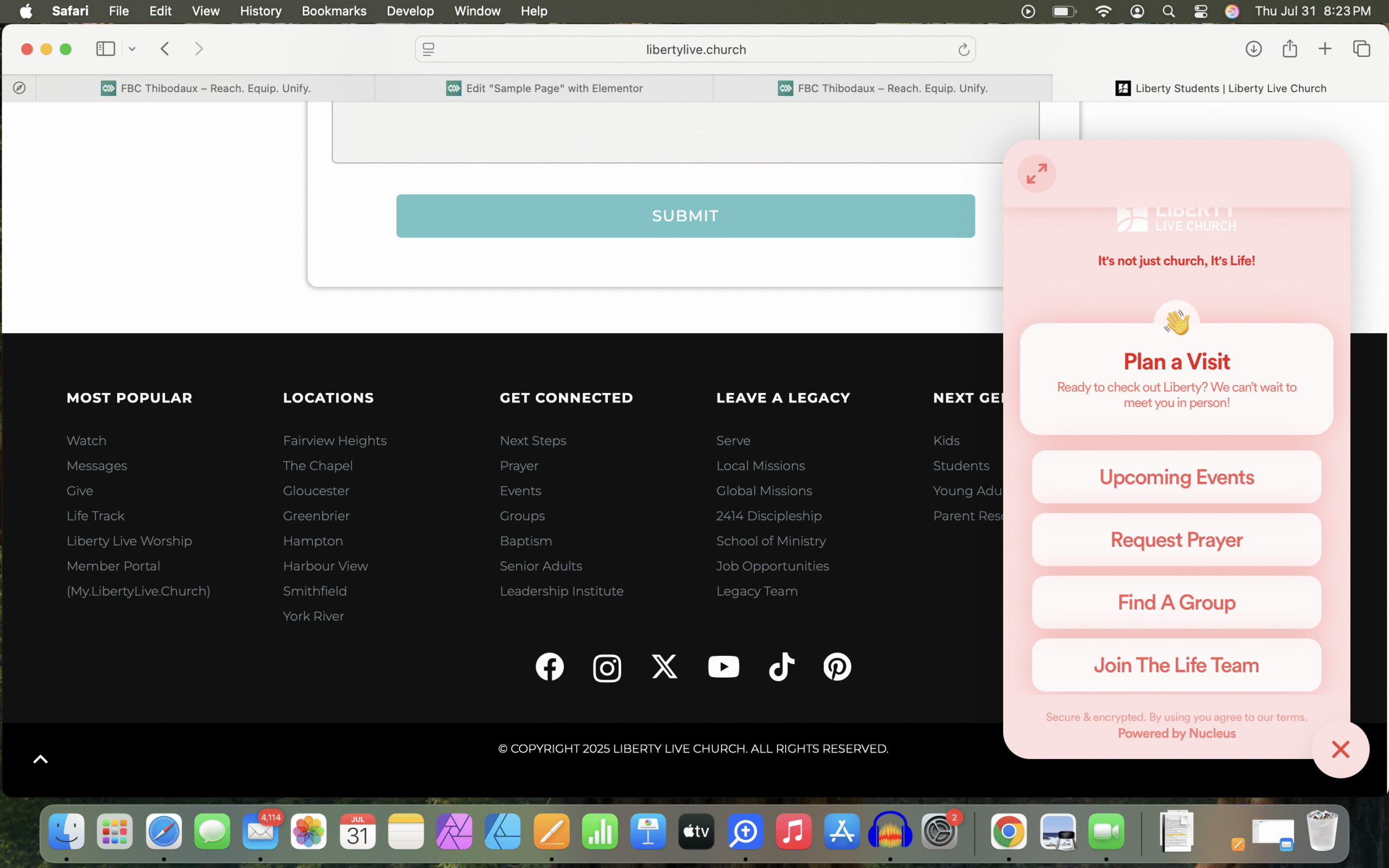
nice, clean looking contact form that is a popup instead of a dedicated page

Don't remember why I did a screenshot on this one; nice menu, clean row setup though